|
|
Post by meltphace on May 6, 2009 23:34:16 GMT
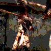
Its been over a month since my last update around this part, so I thought I'd throw this your way. A very much WipEout inspired picture.  |
|
|
|
Post by alx on May 7, 2009 0:31:13 GMT
I have no idea what it is indicative of, but it is definately a smart design. I like the fractals
|
|
|
|
Post by The Crimson One on May 11, 2009 7:13:15 GMT
Yeah, I don't know what the hell is going on there, but I know I like it.
|
|
|
|
Post by meltphace on May 11, 2009 11:38:58 GMT
Thanks for the comments.
Recently I've become a little tired with creature designs. Doing the same old stuff has really worn down on me, and has eventually made me feel somewhat restricted in areas to experiment with. So, this is my first attempt at branching off in another direction. Less heavily textured creatures. And more bold, sleek, design. It just feels like an area I really should try out after all the years of monster designs.
Basically, what you can see there is the form of a Wipeout-style ship simplified, though the wings and back of the ship blend into the background due to them mainly being a flat, bright, white tone. The bottoms of the 3 lined/dotted fractals indicating the tip of each wing. I then used ink spatter and a swirled fractal to give the back of the ship a sort of propulsion effect.
Think I'll do a little more work with muted colours.
|
|
|
|
Post by alx on May 14, 2009 3:24:17 GMT
Slick designs in monochrome? Keep it up...
|
|


 SHF Artist '10